Sunday, December 26, 2010

D&AD

We have developed our previous ideas trying to incorporate the details that would be needed on the packaging.  I have used the french translation as Body Shop use both English and French on their packaging so that it can be sold in Europe and Canada.  I have also included details like ingredients, copyright information and a barcode.

Joana and Natasha's designs are also very organic with a cardboard background so we are all working with a very similar theme.  This week we will decide on which images to use and which fonts work best.

Friday, December 24, 2010

Brad Surcey


Beautiful packaging by Brad Surcey. His packaging designs are all so beautifully thought through and unique to others that are on the market.  

Neon Light Live Brief

Image found via Wild Hearts Can't Be Broken 

I have decided to take on a live brief to design a neon sign for a company that specialises in them.

I began by looking into the different types of neon signs that exist and which direction I would take mine in. The image I have above, the sign 'Wait here I have gone to get help' caught my eye particularly.  I like the way that it interacts with the person viewing it as if it had it's own human qualities.  It also uses a medium that is very permanent to carry a message that is very temporary.

The colours the sign uses make it look urgent and it is in all upper case which also conveys the same message, as if it is about something important, as if the viewer knows what it is about.  This makes the person seeing it wonder what it is about and who has left it allowing them to create their own story.

I want to design a sign that has the same amount of interaction with the audience, that asks them to do something for an unknown reason.

Thursday, December 23, 2010

Wednesday, December 22, 2010

D&AD Progress

We have discussed our separate research and ideas and have made some initial decisions about our designs.  We have decided that the packaging will be predominantly cardboard which will be coated inside to make sure the product stays fresh, the packaging will also be recyclable.  The current Body Shop packaging is really fresh looking and recognisable, however it does not seem to show Body Shop's values.  We have decided to solve this by using textured card and green.  We will also create a variety of different kinds and shapes of product to make sure we have looked at every possibility.

Thursday, December 16, 2010

Up In The Air

I was inspired by watching the patterns that a flock of starlings made.  Their organisation made me want to form typography with the spaces.  I also wanted the starling flying towards the viewer, escaping, 'flying away' from the flock.

Wednesday, December 15, 2010

Friday, December 10, 2010

D&AD

I have now started looking at the D&AD briefs for this year.  I've decided that it would be best to work in a group as together we would have a much wider variety of ideas, and combined we would be able to produce a much more professional outcome.  My group will be with Joana Martins and Natasha Bulley and we have decided to do the Body Shop packaging brief.
   We have begun by looking into already existing Body Shop packaging and other packaging that looks interesting and creative.  We have decided that it is important that the packaging will be sustainable and have looked into many sustainable packaging designs.  The factor we need to make sure we remember are that the product needs to stay fresh and not go off, so the packaging needs to be air tight and sealed.  
   We need to design packaging for four products; a body butter, a White Musk product, a Tea Tree product and a liquid foundation.  The one we feel we will have most trouble with is the foundation as it will need to have a pump on it.

Thursday, December 9, 2010

Friday, December 3, 2010

Thursday, December 2, 2010

Website Designs

I've experimented with several different website headers.  I want it to be instantly interesting and represent me and my work as this is the first thing that anyone visiting the website will see.
I have decided to use a more illustrative header sampling some of the flowers I have used elsewhere in my images.
I want to keep the website very simple and easy to navigate.  I've looked at a variety of different portfolio websites and the ones I feel work best and show the artist's work in the best light are those that are clear and simple, quick to load and do not have too much information on one page.
I have divided my work into four categories, Illustration, Photography, Design and Typography.  This splits my work into four easy groups and distributes the work evenly.  There is less work in the Design page however, hopefully I will have enough to update this soon.  I will keep no more than 14 thumbnails to a page so that the user is not overwhelmed with information. 
I will stick to a black, white and grey colour scheme, only using black to highlight which page the user is on with small splashes of yellow on the header.  This colour scheme keeps the viewer's attention on my work rather than anything else.

Friday, November 26, 2010

V&A Illustration - Just So Stories

The images below are my final designs for the V&A Illustration competition.  I have decided to use bright colours combining simple shapes with intricate patterns.  This style fits well with the  audience the book is aimed at, The Just So Stories are based in Africa so I wanted to combine the African patterns and colours with a more western influence and I feel confident that I have achieved this.  

I have added a gradient to the sky of the original paintings, I was unable to do this smoothly with paint and feel that this pulls the images together well.

The images would work well in a sequence with the illustrations from the other Just So Stories, and given time I would like to explore this.

Friday, November 19, 2010

The Illustration Cupboard

I went to a fantastic Illustration exhibition today that had many children's book illustrations, including work by Anthony Browne, Jane Hissey, Lauren Child, Jill Murphy, Brian Wildsmith and my favourite Maurice Sendak. The images were so detailed and delicate, I was so inspired after leaving I bought the finest fine liner I could find to attempt to make such delicate images.

For more information see here.

Thursday, November 18, 2010

Visual Communication in Context

Thank You
   With only one week to complete this project I found it very hard to settle quickly on one idea before I began exploring it. I decided to use a hand drawn approach to make the 'thank you' more personal and directed to its intended audience, the author Haruki Murakami. I feel I answered this brief, however I would have liked more time to make the book longer with more quotes.


Business Identity
   I found this brief particularly challenging because of the extent we were asked to 'think outside the box'. The idea was to create something completely different that represented the name we were given, that would instantly gain the attention of the people who receive it.

   I found Lise Meitner interesting and challenging at the same time. Her life and achievements gave me many different avenues to follow, however, her biggest acheivement was the thing she was publicly least proud of. I decided to use this to my advantage and keep it hidden within the business card, yet it could still be seen.

   I enjoyed exploring different paper colours and textures to find the right materials for the stationary, eventually deciding on a cream linen effect paper. I also added a graph paper pattern to the design which gave the set the right feel and pulled the pieces together.


Graphic Systems
   I enjoyed this project and the challenges it brought. It was interesting researching into different book covers and graphic systems, as they are often overlooked and taken for granted. Like many other areas, it was difficult creating something original as so many book covers exist, however this made it easy to find what worked well and what did not. There are many trends associated with the book cover designs. Currently book covers tend to have very simple covers with clean designs and large typography.

   This project made me appreciate the importance of knowing the audience I am designing for and the most effective way to display different levels of information. I have found this project extremely challenging in terms of time deadlines but I feel that I kept up and produced work that I am happy with. Were I to have more time I would explore several of my other ideas in more depth.

   From this unit I have realised how difficult it is to print true to colour. I have had a lot of difficulties with colours appearing very different on screen to the actual colours that are printing. This has meant that I have had to print several documents repeatedly to find the right colours. Also text has been lost against backgrounds and gradients have become more harsh and less gradual. This has taught me the importance of leaving enough time to make sure my colours are correct before I handing files over to potential clients, and also to constantly check my work as I go along.

   I have also had difficulty with time management in this project, something I have not had trouble with before. Having several smaller projects within short spaces of time has meant that I must be constantly working to make sure my designs are on schedule for Critiques and finally the hand in. This has meant my whole design process and idea generation has had to be sped up. As I constantly try to make my work to the highest quality possible this is not something I felt very comfortable doing. This year I have also been working on other projects and live briefs which has meant juggling course work with other briefs. I am aware that I will need to learn better how to prioritise in order to get everything done. This year I have also been bearing in mind that I need to make my work of a quality which can be used in my portfolio, and that the work should represent myself and my ways of working.


Friday, November 12, 2010

Graphic Systems

      I decided to choose Ian McEwan from the list of authors as I know his books well.  Having read his books I realised that there is a strong theme of relationships running through them.  McEwan’s books are generally targetted towards a broad adult audience of both men and women.  As I have read and enjoyed several of his novels I decided to direct the cover designs at a younger audience, mid twenties to early thirties.

  I wanted to aim the book covers at a younger audience than McEwan’s current covers which are photography based designs, which I feel look tired and dull. Using brighter colours and simple uncluttered designs will make them more eye catching and appealling to a new readership.

I decided to use the important events in each story and create these as simplistically as possible in Illustrator.  Rather than using the images of people I used silhouettes as I felt the magic of a book is for the reader to make the images for themselves.

The fonts I made using circles in Illustrator  looked much more integrated with the image and more interesting than conventional typefaces.  Looking at books in bookshops I realised the book spine is particularly important as this is constantly on show.  I tried to integrate the back and spine with the front cover design to make the image flow across.  

  I have used a different colour scheme for each book relating to the storyline.  In terms of a graphic system I tried to stick as closely as I could to a frame, placing the text centrally.  However, in some cases I did need to adapt the frame to fit with the image although I do not feel that this  removes them from the Graphic System.


Wednesday, November 10, 2010

V&A Illustration

I recently saw the winning entries for the V&A Illustration Awards on display at the V&A and thought that I would enter my own this year.

I looked at several ideas for illustrations but in the end decided to illustrate two stories from the 'Just So Stories' by Rudyard Kipling.  I decided that I would illustrate 'The Butterfly that Stamped' and 'The Cat that Walked Alone'.  I wanted to use a bright colourful technique with colour washes and intricate pattern.  the books are read by both children and adults so it was important that the images would appeal to both.

The first images I produced I was not completely satisfied with, they did not hold together well and looked slightly flat.  I changed the size to make them square rather than rectangular.  This reduced any unnecessary space and made the images much more cohesive.  Once the images were finished I added a gradient pattern in Photoshop to the sky in both images, this made them much more dynamic.

I am very happy with the colours in the illustrations.  I used gouache in my final paintings, rather than watercolours, which I had previously used.  This made the colour much more intense. The shape of the canvas made a big difference in the over all composition.

Nathan Burton

Nathan Burton has done some fantastic series book cover designs.  His font choices are always very interesting and seem to fit the particular author and audience really well.  Burton's non-fiction series' by Chris Yates and Roger Deacon are particularly effective, I really like the imagery and and the way they are used to frame the book titles.  I hope to use a technique like this for my own designs.
The image I have used here is of his cover for Steve Toltz, the colours work really well on this cover and the cut out effect is different and interesting.
For more of Nathan Burton's work please visit here.

David Pearson

David Pearson is a London-based designer who has done a lot of work for covers.  Pearson's designs are a great example of Graphic systems as he uses a system for a series and changes each cover and their specified theme to fit that system.  These designs are for 'Great Loves' for Penguin, the spines look particularly good when put together, the colours all complementing each other.
For more of David Pearson's work see his website here.

Jim Tierney

While researching I came across some work by Jim Tierney. His designs are current and interesting, a great example of the direction I should head in with my book covers.  He uses break colours and clever ideas, often using textures to give his covers depth.
See more of his work here.

Monday, November 8, 2010

Pan Am Guide Covers

I absolutely love these retro Pan Am Travel Guides.  The colours are exciting and they fit together as a set really well.  The simplistic images and patterns clearly and instantly represent each country.

Friday, October 29, 2010

Business Identity

Lise Meitner is the woman that discovered nuclear fission which eventually lead to the creation of the atomic bomb.  I wanted to design her a stationary set that reflected her work as a physicist and mathematician that also drew on the business card designs that existed in her time.
   The font choice I made was Minion Pro a serif font that is simple and elegant.  Lise Meitner was frequently over looked as a woman scientist, for example, her male partner won the nobel prize for her discovery.  Because of this I decided to leave her gender off her card, showing her name as 'L. Meitner'.
   I have used a cream coloured linen effect paper for the stationary, the colour resembling those used in the 1930s.  I also added a light graph paper effect to bring in her work as a mathematician.  I wanted to combine the 1930s business card designs and artwork from the time when Meitner discovered nuclear fission, with a more modern approach.
   I wanted Meitner's card to be different and attract people's attention and I found the best way to do this was to use Meitner's connection to the atomic bomb, making a pop-up explosion when the card is opened.  I have kept the explosion hidden away until the card is opened to reflect Meitner's regret at her association with the atomic bomb.

Thursday, October 28, 2010

Brad Surcey

While researching into business cards and stationary sets I came across Brad Surcey who has created some beautiful cohesive sets.  I included images below of two in particular that caught my eye.   I love the bright colours and combination of pattern and block colour in the first image.  The plastic semi-opaque cards look substantial and like something you would be happy to hold on to.
The second set uses more softer colours with beautiful ornate typography for a different kind of audience or client.  This set again holds together beautifully and although it has intricate patterns it is also simplistic and clean.
For more designs visit his website.

Wednesday, October 27, 2010

Lise Meitner

   The next project, 'Business Identity' is to create a stationary set for a known person.  the person I picked out of the hat was Austrian-born, later Swedish Physicist who was part of the team that discovered Nuclear Fission which later lead to the invention of he Atom Bomb.  Meitner was overlooked for a nobel prize that was instead awarded to her male partner, Otto Hahn.

Tuesday, October 12, 2010

Thank You Haruki Murakami

I have picked the author Haruki Murakami to say thank you to.  In recognition of his work and the inspiration he has given me. 
I decided that the best way to say thank you is to use the words of the people he admires and thank him in their words.  Murakami frequently uses Western references, musicians and authors in his novels.  The people he mentions are people he respects and admires so I chose four and used their quotes. I have reflected the way he combines Western and Japanese cultures by using a Japanese blossom pattern on the back of the book.
Unfortunately the paper quality isn't as good as it could have been so the ink has gone though from one side to the other so given time I would have used better materials.

Sunday, October 10, 2010

Thank You

   For the first project withing 'Visual Communication in Context' I have decided to choose the author Harauki Murakami to thank.  I have read many of his books and did my previous dissertation on the 'Search for Identity within the Novels of Haruki Muakami'.  I have refreshed my knowledge by looking through information on him and looking into interviews with him.  From the information I have read I feel that it is important to make sure I concentrate on his references to Western Culture within his books.
For more information on Haruki Murakami visit here.

Saturday, October 9, 2010

Second Year

We have been thrown into this year with a long three part project concentrating on design for print for specific audiences. After a long summer it is quite a shock to come straight back to work towards deadlines but it is good to have some structure again.

This year I would like to improve my technical ability, making sure I follow briefs to the letter and do not miss out on any specifications that mean I may lose marks. I would also like to involve myself more in projects outside university, working on competition and live briefs. I will also try to move outside my comfort zone to make sure I improve and extend my skills. I would like to become more knowledgeable about more practitioners in the field and read and research more thoroughly than in my first year.

Friday, June 11, 2010

Open Garden Poster

Final design for the open garden poster.

Wednesday, June 9, 2010

Open Garden

The image for a retro style garden open day poster.

Sunday, May 16, 2010

Thursday, May 13, 2010

Springhead Plant Lovers' Day

I've recently been working on designing publicity materials for an event at Springhead Garden. I went there today and took a few photos, it was really great to see people wandering around with the brochures that I had designed.
More photos of the event are here

Tann Westlake

For the second half of my work placement I have been working with Tann Westlake based in Sussex on the re-branding for Littlehampton Harbour. This is a really great project to contribute to and a nice change to spend a long time on one project rather than the quickly produced pieces with Tasty marketing.
Simon, who i have been working with has been really supportive guiding me though what I need to do. I've spent time producing logos and advertisements designed to be in magazines promoting Littlehampton Harbour. the harbour is looking to have a completely new image to appeal at a more liesure boat type market rather than it's current industrial, fishing image. I also visited Littlehampton to get an idea of the place, the weather was quite dull so the photos I took are not wonderful but they were a help for inspiration.
More photos can be found here

Tasty Marketing

For my first work placement I worked a week at Tasty Marketing in the Enterprise Pavillion. This was an interesting week doing very varied work from writing press releases to designing advertisements. This was a useful experience, working in an office related environment however I do not want to do this line of work in the future as it seems very limiting and the idea of working on a computer all day would kill me.
I am incredibly grateful for the oportunity to experience a Marketing company and I managed to produce several pieces that I was pleased with, however I would prefer to be more hands on in my approach to solutions.

Tuesday, May 11, 2010

V&A

Hanging glass sculpture in the entrance of the V&A

I went to the V&A at the weekend to see the Quilts exhibition, quilts from 1700 - 2010. The exhibition was really interesting and varied, the stories that went with each quilt were fascinating and often moving. The below quilt, 'Punctuation' by Sarah Impey was my favourite, she played between constructing the written word and manufacturing the quilt.

Thursday, May 6, 2010

Tuesday, April 20, 2010

Layout PPRD

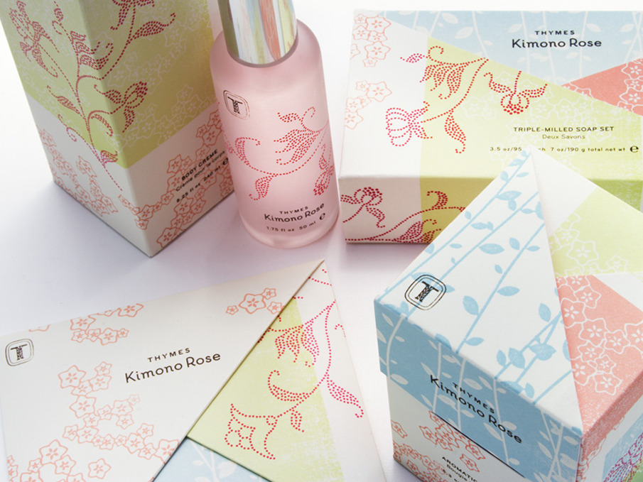
I have enjoyed this project the most so far, unfortunately not because of the layouts but because it has given me the opportunity to use illustrations.

I was annoyed at the beginning of this project because I was told my illustration was too ‘me’. I understand why I was told this, that is was too early to settle on a design and that the idea of the course was to experiment. However, this did raise a lot of questions for me as to where I would like this course to take me.

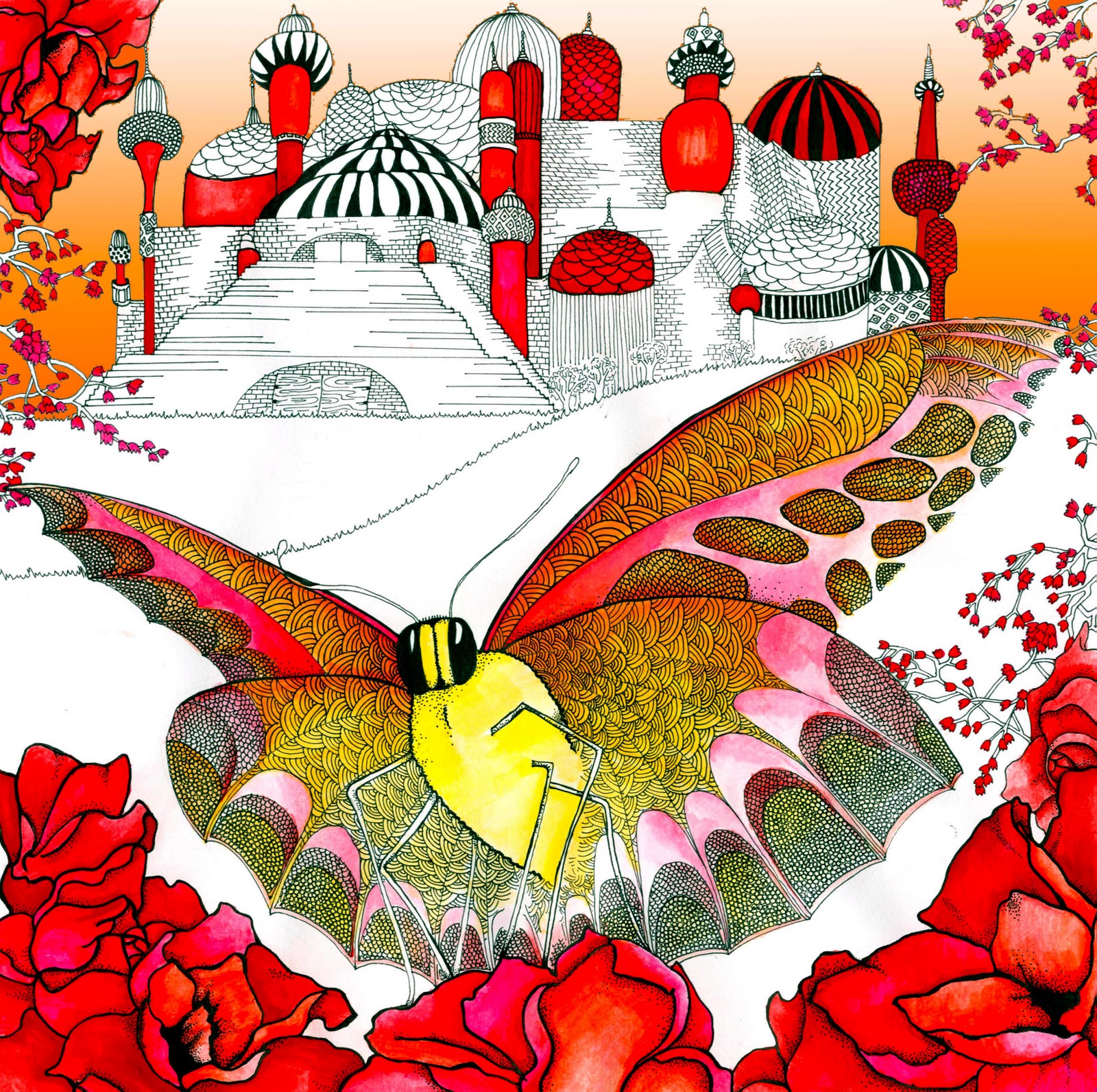
I am an organised and methodical person and unfortunately this shows in my work, making it hard to be loose and experimental. However, being pushed by my tutors allowed me to try techniques I would not have ordinarily. I used 3D letters that I had made out of card, placing them in different environments. I also painted a free hand header with ink that I thought worked so well I decided to use.

I gained a lot from the photographer I was looking at, Bruce Connew. To begin with I was worried about being given a photographer as I felt it limited my illustration options. However, I actually felt very inspired by his work, and by his words. I sent him an email at the beginning of the project with a few additional questions, and although he took some chasing, his reply was more than I could have hoped for. He took a lot of time with his answers even though he knew it was just a university project. He also sent a photo from his new, unfinished series which I felt so honoured to have. He also sent me the link to his favourite photograph, I found the reasons behind his choice so interesting. He made the choice not to use text in his books but the clear amount of thought behind each image makes me really wish he had.

I found it difficult to reflect Bruce Connew’s personality visually in the layout, as people are not as simple as they may appear. His work is thoughtful and organised yet his life is spontaneous and dangerous. I used a combination of organised white spaces and neat base text in contrast to the flowing title page and stamp effect sub-heading. I decided to do the whole article in black and white as I felt this simplicity reflected his words better, it also put emphasis on the layout and typography and image choices. I feel that black and white also gives an idea of photography relating to the past, and black and white photography is a technique that Connew often employs.

I was very pleased with my final illustration as I feel the developments I made to it allowed it to work in a much more interesting way. I used photographs I had taken of someone with a camera to paint a black and white, contrasting ink painting. I then wanted to illustrate Connew’s belief that, ‘we are here temporarily, we’re all migrants, from somewhere to somewhere.’ I then used cut out shapes from the body and added small squares as if they were peeling away. I wanted these to represent photographs, drifting away, ‘the photographs will disappear, the books will fall into the ocean in the next major earthquake.’

I found learning InDesign very useful as it is software I have used frequently recently yet I have never actually learnt how to use it. I found it simple to learn and I know it will be very useful in the future.

In the future I would like to attempt a layout that allows me to be much more free in my designs, experimenting with space and illustrations a lot more. Looking at other magazine layouts I found that the most interesting were either the very simplistic or those that tried something very different.