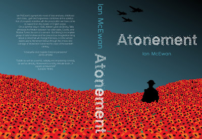
I decided to choose Ian McEwan from the list of authors as I know his books well. Having read his books I realised that there is a strong theme of relationships running through them. McEwan’s books are generally targetted towards a broad adult audience of both men and women. As I have read and enjoyed several of his novels I decided to direct the cover designs at a younger audience, mid twenties to early thirties.
I wanted to aim the book covers at a younger audience than McEwan’s current covers which are photography based designs, which I feel look tired and dull. Using brighter colours and simple uncluttered designs will make them more eye catching and appealling to a new readership.
I decided to use the important events in each story and create these as simplistically as possible in Illustrator. Rather than using the images of people I used silhouettes as I felt the magic of a book is for the reader to make the images for themselves.
The fonts I made using circles in Illustrator looked much more integrated with the image and more interesting than conventional typefaces. Looking at books in bookshops I realised the book spine is particularly important as this is constantly on show. I tried to integrate the back and spine with the front cover design to make the image flow across.
I have used a different colour scheme for each book relating to the storyline. In terms of a graphic system I tried to stick as closely as I could to a frame, placing the text centrally. However, in some cases I did need to adapt the frame to fit with the image although I do not feel that this removes them from the Graphic System.


No comments:
Post a Comment