Sunday, February 13, 2011

Professional Project Learning Agreement

With the introduction of kindles, iPads and other electronic innovations books are becoming less popular, particularly to teenagers and young adults.  I would like to combine my interest in language with that of illustration by exploring the relationship between text and images to make the book visually more appealing and collectable.  Text is often uniform and visually uninteresting in poetry books, to over come this I will discover a technique to combine the text with the image whilst being influenced by the flow of language, meter, cadences, emphasis and emotion to dictate how the text is presented visually.  Whilst this will make the text visually more interesting, it will also help the reader maintain interest and understand the way the text is meant to be read.

   I have looked at Sam Winston's work with language, in particular his dictionary storybook in which he questions our understanding of language both as carriers of messages and information itself.   I have also looked into pop-up books and books that change or develop the relationship between text and image.  In particular, children's book illustrators, Lauren Child who used language creatively in 'That Pesky Rat', and Jon Scieszka and Lane Smith who wrote and illustrated 'The Stinky Cheeseman', have successfully integrated text and image. These books work because they interact with the reader, as they have to turn the book to read the text as they follow it across the page.  This is an excitement that is lost as the reader matures and books become more visually uninteresting. Most books for adult readers use text simply to present the narrative through words as code rather than using the visual appearance of the words and letters themselves to enhance the meaning and add to the pleasure.  I will need to make sure the book does not look too juvenile, appealing to the wrong age group. I can do this by keeping the text small and readable and the images mature yet stylized.    

< Included in the references I will use for my combined typography and images are; ‘New Ornamental Type: Decorative Lettering in the Digital Age’ by Steve Heller and Gail Anderson, and ‘Hand Job: A Catalogue of Type’ by Michael Perry, both concentrating particularly on hand drawn typography.  I will also look into Lesley Barnes’ illustrations that combine poetry and words, and Rob Ryan’s books collaborating with Carol Duffy in which the poem is found within his paper cuttings.  I will also look at various books and magazines that concentrate on contemporary illustrations.  I will also look into historical art references relating to the time the poem was written. I will research into other books that experiment with the way images and text relate to each other.  I will also look at different illustrators, those who illustrate books and those who create images appealing to my particular audience.

I will research into who reads poetry, and where there is an audience whose needs are not being addressed. I will also question people as to their reaction to the poem, how it makes them feel and what images it brings to mind.  I will listen to various people read the poem aloud so that I can see where patterns occur and how people perceive the language.

Many poems have visual language creating instant images in the reader’s mind. Whilst I will take these into consideration, I will also look beyond the obvious imagery, and research deeper into the language discovering previously hidden ideas.

will need to look into paper stock, book binding and print techniques that would enhance my book, as well as consider pop-ups, pull outs and other ways to experiment with the way the page is presented.

Once I have decided on my text I will need to look into the size of my book, the way the text will be split and how many pages and illustrations I will need.

Thursday, February 3, 2011

Learning Agreement Presentation

Today we had our presentations for our learning agreement, this gave us an opportunity to gain feedback and ideas from tutors and other students and also the first chance to hear everyone else's ideas.  There was a  very wide range of ideas and some interesting ideas.
I had prepared a presentation with images to support my ideas.  I had considered my brief to be strong and thought through however several concerns were raised which has made me doubt the strength of my idea.  I was able to justify my reasons but it did plant doubts in my head.  I plan to have a tutorial tomorrow to make sure I know exactly what I would like to have in my learning agreement as once it is handed in it cannot be changed.

Sunday, January 30, 2011

Illustration Friday - Surrender


Illustration Friday Submission for the topic 'Surrender'.

Final Major Project

We received our briefing for the Professional Project yesterday and were encouraged to chose a project that was related to the direction we wish to take in the future.  With this in mind I will be making a book that combines my love of illustration and typography.  This project feels daunting as it is much longer than we have spent on a project and it because the brief is so open this makes the options endless.  However I am really looking forward to getting on with it and creating something completely my own.

Tuesday, January 25, 2011

Threadless T-Shirt Design

I have entered Threadless' T-Shirt design competition sposored by Sharpie pens.  The theme was to design a t-shirt inspired by the 80s using only the colours that would be sold in Sharpie's new 80s collection.
I decided to use the fashions from the 80s as my inspiration.
To vote follow this link.

Portfolio

I am currently putting together my paper based portfolio to prepare for my third year of study.  After speaking to tutors I have gone through all my work and picked out the best 15 or so pieces.
I wanted to make sure I had a mix of pieces to show my skills whit a combination of work I had produced in my own time, and through the course to show the progress I had made.
For presentation I have done a lot of research and for my own work I have decided the best option would be to use an A3 folder with printed layouts of my best work.  I'll use a brief description on each, allowing myself room to expand in the interview.

Friday, January 14, 2011

Monday, January 10, 2011

Website PPRD

I found Dreamweaver extremely difficult to learn as it was different to any other program I had used before.  The site I had designed only needed Dreamweaver in order to make it so I did not need to use Flash or Lightbox which kept things much more simple for me.  I used Photoshop initially, making use of the slice tool to keep proportions exact.

Researching into many different artists' websites and looking into what makes good web design allowed me to realise what worked well and what did not in terms of website design.

I was aware that the navigation needed to be very simple and easy to use as it could be extremely frustrating having to go through several levels to view what you wanted or to be unable to find a certain page. I overcame this problem by having my menu clearly on the left of my site.

As well as a contact page I put my e-mail address in the top right hand corner to make it easily accessible.

With the Illustration page, and Photography I had too may images to fit comfortably on one page so I made two pages and split the thumbnails between them.  This way the page does not look too cluttered.

I took a while to decide what to use as my website header as I wanted to create a brand that represented myself.  I used an image of flowers partially obscuring my name; this works well with the images on my site as they are in a similar ink and line drawn style.  The splash of yellow ink adds some colour to the otherwise grey, black and white site.  This was a conscious decision as I wanted to keep my site simple with very little colour in order to make my images stand out.

I faced problems when I had not used my CSS page effectively, so many images were duplicated on each page and my buttons often jumped around out of place.  Fortunately I became aware of this very early on so it was not a big issue to make these changes and definitely benefited the consistency of my site.

Once I had finished with the designs and using the 'Swap Image' function in Behaviours to display my images I was able to adjust certain features which could be better.  I began by changing the size of my buttons as they were slightly too big, I did not change the size drastically as I did not want too much open space but I am much happier with their size now.  I also changed my 'Contact' page, adding in a contact form which looks much more professional and is far more convenient for anyone visiting the page.  I attempted re-designing the Facebook and Twitter buttons, however their design and colour actually seemed to fit better with my page rather than making them unnecessarily different.

I am really pleased with my page and when I compare it to my initial designs it is exactly how I had planned, apart from a few changes which it became apparent needed to be made.  I also feel much more confident on Dreamweaver and would not be afraid to use it again in the future.

Website Finishing Touches

I've added a favicon to my website, so that a small flower shows when it is saved in favourites and along the web address bar.

I have also adjusted the size of the text on the navigational buttons on the site as they were too large.  They seemed like they worked on a larger screen resolution, but after looking at my site on a laptop I realsied they were slightly too big.

I have changed my contact page, so that it now has a contact form.  This protects me from receiving spam and makes it much easier for someone visiting the site to comment instantly.

I have also re-designed the 'About' page as it looked slightly out of place before.  I have got rid of the grey background and reduced the size of the text.

Thursday, January 6, 2011

Neon Lights


I made several sign design proposals for a neon sign company.  I decided to design signs that interacted with the person who would see it, a sign that would make you look again.


I looked at several phrases, ones that people would want to purchase to use on their walls or in public buildings.  I decided to choose these as my final designs because they would appeal to a wide audience and are different to the more commercial neon signs that are frequently seen.


It was difficult to find a font that would be appropriate to a neon sign, so I decided to make one that  would be readable and easily made into a sign.  I decided on single colour signs as these stood out better and could be read much more easily from a distance.

Wednesday, January 5, 2011

For Fun

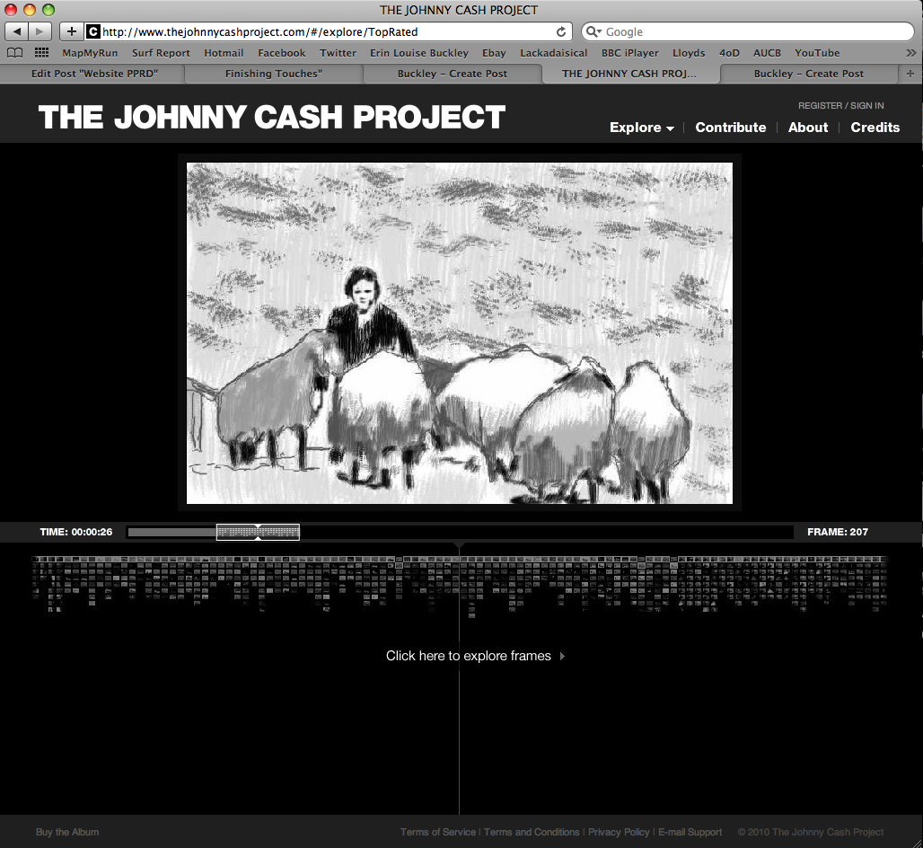
I recently came across this really interesting project to create a music video to Johnny Cash's 'Ain't No Grave'.  Each person submits a frame and them all the frames are put together for a really interesting effect. It's quite hard t spot your own frame but nice to be part of something like this.

D&AD Decisions

We have all tried some different design ideas over the Christmas break and today we have looked at each others to decide which elements work well and which do not.    We are all keen on using a raw cardboard to make the product look more ethical and we think that colour is also important.  Joana has used a letterpress font which works really well with cardboard.

My designs are below, I have used a cardboard texture to show how they will look, I would like to use an embossed enamel effect for the images and text.  I've experimented with a line drawing effect which looks delicate and feminine and carries across the different products well.  The text and over all design, however, does need more work on it so we will now look at combining our ideas and developing them.


As a group we have talked about the different shapes of the bottles, we have decided to keep the shapes simple in a way that can be made out of cardboard.  The brief seems to be more concerned with the label designs so we did not want to spend too much time on bottle shapes.  Now they are decided and we know which products we are designing for it is easier for us to go away now and work on the label designs.


Tuesday, January 4, 2011

Website Testing

I have now had to test my website on a combination of different browsers and machines to make sure that is appears as it is meant to.  The variants that I have had to check are that the colours are correct, that all the links work, external and internal and also that the size is easily viewable.  I tested my website on different browsers using Browser Lab and did not have any issues.

However, I decided to check my website worked on different machines; it worked well on a Mac and a PC, however on a laptop and smaller screen sizes the website appeared slightly too large meaning that the user had to scroll down to view all the menu options.

I overcame these issues by moving the menu buttons closer together whilst making the text slightly smaller.  This works much better and looks much neater on a both a smaller and larger resolution.

Another issue that was brought up in the critique was that the email button located on the header was slightly to large so could be accidentally clicked on.  This was because I had made too larger slice when I moved the image from Photoshop.  I changed this by making the slice smaller and works much more efficiently now.

Sunday, January 2, 2011

D&AD New Ideas

Our designs have changed a lot following recent tutorials.  We have decided to use much more lasting containers, that can also be recycled as well.  The products will be made mostly from recycled glass.  
The products Body Shop currently puts in tubs will now be put in preserving jars.  These jars will keep the products fresh and can also be used for food or any number of things after the product has been used up.  We will put a pattern and Body Shop logo directly onto the glass, this way when the jar is used around the house, it will still have the logo on it.
Another option we considered with this new design is the idea of refills.  Many other shops currently offer a refill system where the consumer may return and fill an empty pot with a product for a fraction of the original price.  We have not yet discussed the logistics of this but it is an idea we feel embraces may of Body Shop's principles.