Sunday, October 30, 2011

The Bloody Chamber Book Cover


Negotiated Practice

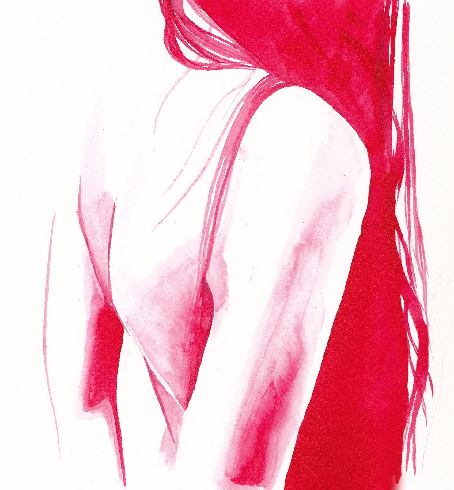
'But he would not let me take off my ruby choker, although it was growing very uncomfortable, nor fasten up my descending hair, the sign of a virginity so recently ruptured that still remained a wounded presence between us.'


Monday, October 24, 2011

Individual Tutorial

Todays tutorial was to look through all the work I have done so far. My tutor looked commented on what worked and did not, and suggested I loosen up a bit more with my ink work.  He suggested I look into David Hockney's etchings and Michael Gillette.  It was also suggested that I should make intentional mistakes, splashes and drips and also try working on a larger scale.

Tutorial

Todays tutorial with Joel and Marcus was with everyone that was looking at 'The Bloody Chamber' brief, so it was interesting to see what direction other people were taking.  Everyone seems to be concentrating on the gothic aspect and on femininity, although the way in which these are interpreted vary greatly.  I found the photography particularly interesting, and the way people were able to capture the dark mood of the short stories.

I was advised to concentrate on my ink work, as the pen definition in faces made them look slightly over worked.  I agree with this and a piece that was picked out as an example of where my ink work is effective is one that I was quite keen on.  I always find it strange when something that is sketched so quickly can capture a mood or feeling that a time consuming image cannot.

In terms of my book cover, I was advised to put a background on it to give it more depth.

Lace

'Then I realised, with a shock of surprise, how it must have been my innocence that captivated him.'
'Our destination, my destiny.'

I have been working on an idea for lace typography for the front cover of Anegla Carter's 'Bloody Chamber' so thought it might be interesting to integrate that into the images inside the book.

Wednesday, October 19, 2011

Final Polarpatterns Banner

Above is the final banner for the Polarpatterns website.  I combined elements from my previous designs to make the letters readable but slightly obscured.

Monday, October 17, 2011

Tutorial

This week's tutorial was with Anna and Joel. Only two people were there so we got a lot more time to talk about our work.  It was suggested I look into fashion photography, for ideas of poses and distortion.

Friday, October 14, 2011

Individual Tutorial

I booked an individual tutorial with Joel and Lisa so that I could make sure my work was in the right direction.  Moving from Visual Communications made me worry that I might be working quite differently to other people.

Most points that were made were in terms of presentation, that I should use larger paper keeping white space around the images.  I should also avoid annotating in my sketchbook as it ruins images.

I was given a lot of names of illustrators to look into for inspiration and research.  I'm really glad I had this tutorial as I left with lots of ideas and it was good to confirm my work was headed in the right direction.

Wednesday, October 12, 2011

Polarpatterns Banner


I have been asked by a London based composer, sound artist and practicing architectural acoustician to create typography and illustrations for a new website.  She asked for drawn typography that gives a hand drawn, pencil on paper feeling.  She felt that this would be a good contradiction to the sound, which is mainly made on computers so is more abstracted.  She also likes lots of detail and when letters are slightly hidden so you have to look for them.

I decided to use a pen line drawn technique, using the negative space between pattern to show the letters.  I also tried another method, using the pattern to fill the letters.  I sent these options to my client to see which they preferred and they wanted to combine elements from the first two.

Monday, October 10, 2011

First Tutorial

This tutorial was with Marcus Oalkley and Salvatore Rubbino and was a really useful starting point for the project.  They looked at our recent work and talked about what direction we were going in and where we would like to take it.  Because their ideas and work are so different it was great to get a mix of opinions and suggestions.

Saturday, October 8, 2011

A View of Students' Work

Today we were given the chance to show our work to the class and to a visiting Illustrator, Holly Wales.  We were asked to chose three pieces that represent the direction we wish to take in level 6.  I decided to include a typographic piece as I would like to continue exploring my interest in expressive typography, I chose a figure drawn in pen and ink, as this is a style I enjoy working in, particularly with figures and in greyscale with an occasional splash of colour, and finally a double page layout from my 'Lady of Shallot' book as this combined image and text with a delicate style I have began sing more recently.

As I had moved over from Visual Communications this was a great opportunity, for me to see the other student's work and the variety of styles used within the course.  I was interested to see how broadly the term 'Illustration' could be used to include so many different medias and ideas.  This was incredibly inspiring and I found it very interesting to here each person talk about their work and their different passions for the subject.

Holly Wales

Holly Wales gave a lecture today, talking about her own work, her motivations and advise to people entering the industry.

Her lecture was interesting, particularly the distinction she made between commercial and non-commercial work.  She stated how important she believed both were and the knowledge and fun she gained from her collaborations, making me feel that this is definitely something I would like to be involved in at some point.

Illustration Level 6

A new year starts in a new course, finishing the degree with the third year of Illustration.  Obviously starting a new year is always difficult, especially as my last two years have been centered around Graphic Design.  This year seems to be focussing on the direction we wish to take with our work and our careers.  For many people this seems to already be resolved, unfortunately I do not feel like I have had enough experience or chances for experimentation to know clearly where I see myself in the future.

I know the materials I am comfortable using and the artists whom I am passionate about, however I do not feel that this is enough, that I would relish the opportunity to push myself further.