Monday, December 26, 2011

Professional Project

The briefing for this project filled me with terror and excitement simultaneously! I had been thinking about the professional project fro a long time, trying to work about what the best way to showcase my work would be, but finally hearing the briefing made everything a lot more real.

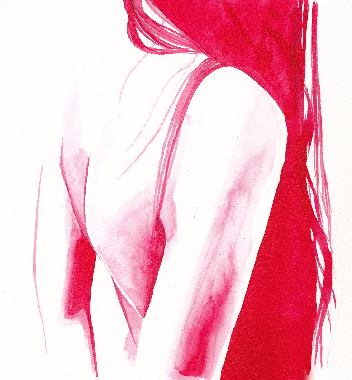
I have, after a lot of thought, decided to create a children's book based on a story I have written.  Although I have not produced anything like this before I feel that it would be a really great project to develop and challenge my skills.  I have worked a lot in black and white recently so would like to add colour, but also stick with the ink and water technique I have been using.  I would also like to expand the project and think about creating three dimensional characters and posters from the artwork. I know my project will change a lot on the journey buut I will begin by experimenting with styles and considering the storyboard.

Week of Inspiration

The last week before Christmas was a week full of lectures from different illustrators, the talks were incredibly interesting and were also very inspiring. I was having difficulty deciding what my final project should be, and I was beginning to feel overwhelmed about it, however now I feel confident in my decision to create a children's book and am really looking forward to experimenting and developing it.

I found Salvitore Rubbino particularly interesting, the way his books develop and change through time and conversations with publishers.  I love his use of texture in his work and the variety of methods he brings together cohesively.  Seeing his storyboarding and process has helped me a lot in knowing the best way to work.

Hayley Potter's talk was very useful, she showed how she had developed since university highlighting that the experimenting never finishes, and that my work will change constantly.  I found the way she used one piece but in such a variety of ways, for example on cushions or 3D really interesting and something I would really like to try next year.  

After Hayley Potter, David Callow spoke, I have admired his work for a long time so I was really looking forward to this talk.  His work is so intricate and beautiful, it was amazing to see it projected on the large screen and hear about how much work went into each piece.  Similar to Hayley, David also re-uses images that have worked will but changes them to fit different briefs.

Friday, December 23, 2011

Natural History Museum

The Natural History Museum was great to see some really weird and interesting fish that I would not have seen otherwise.  It was also interesting to see the model of the whale, to get some idea of how huge it is and how it would look in relation to other characters in the story.


Tuesday, December 20, 2011

Tuesday, November 29, 2011

Monday, November 28, 2011

Sunday, November 27, 2011

Hair

It was suggested in the critique that I look at hair in other forms, how when it is not attached to the head it seems to be much more disgusting.

Monday, November 21, 2011

Critique


Above are the images I presented in my critique.  I wanted to bring a variety from each of the different stories.  It was agreed that those that did not show faces were more effective. 
It was suggested I move away from the competition brief and begin experimenting with women's hair and backs.  I should also do some observational drawings to strengthen my connection to these elements.

Friday, November 18, 2011

The Bloody Chamber Book Cover


Above is the final book cover design for Angela Carter's 'The Bloody Chamber'  I inverted the drawn lace design which gives a much better representation of lace and makes the words stand out better.  I then added an image of a wood behind the text to give the cover more depth, I then changed the saturation to make the image red which gives it a much more ominous feel and illustrates the tone of the stories better.

Monday, November 14, 2011

Electric Eden Final Banner

My client prefered this banner but wanted colour on it.  I decided to colour it digitally to get a stronger colour.

Friday, November 11, 2011

Polarpatterns Thumbnails


My client needs six thumbnails for their website, leading to their different projects.  She asked for images that represent the title, for example 'breathe' or 'wooden' however she wanted these images to be slightly abstract.  I decided to stay with the black and white colour scheme and to use the idea of pattern that I used in the title.  I tried various different drawings and patterns, using pen and ink.

Wednesday, November 9, 2011

Ink Faces


Tutorial advice suggested I loosen up a big with my ink work to allow 'intentional mistakes' like ink splashes and dribbles.  I am quite pleased with these two images that use a very different style than I am used to.  I discovered it does not work as well when faces are not included as it needs some definition in contrast to the splashes.  In terms of this project it might be worth working with darker colours to get a more haunting image.

Lillies


I have expanded on the image I painted earlier, of a woman's back, to include lillies, an image that is mentioned frequently in Angela Carter's 'Bloody Chamber'.  I do llike these pieces but I feel that the simplicity of the earlier image worked better.

Ink Continued


'There's nobody here but us two, my darling.'

'I felt as giddy as if I were on the edge  of a precipice; I was afraid, not so much of him, of his monstrous oresence, heavy as if he had been gifted of birth with more specific gravity than the rest of us, the presence that, even when I thought myself in love with him, always subtly oppressed me...No.  I was not afraid of him; but of myself.'

Electric Eden Records Banner


Above is some work I have been doing for a record label who need a banner for their website.  The two vaiations centre around a theme of the garden of Eden.

Sunday, October 30, 2011

The Bloody Chamber Book Cover


Negotiated Practice

'But he would not let me take off my ruby choker, although it was growing very uncomfortable, nor fasten up my descending hair, the sign of a virginity so recently ruptured that still remained a wounded presence between us.'


Monday, October 24, 2011

Individual Tutorial

Todays tutorial was to look through all the work I have done so far. My tutor looked commented on what worked and did not, and suggested I loosen up a bit more with my ink work.  He suggested I look into David Hockney's etchings and Michael Gillette.  It was also suggested that I should make intentional mistakes, splashes and drips and also try working on a larger scale.

Tutorial

Todays tutorial with Joel and Marcus was with everyone that was looking at 'The Bloody Chamber' brief, so it was interesting to see what direction other people were taking.  Everyone seems to be concentrating on the gothic aspect and on femininity, although the way in which these are interpreted vary greatly.  I found the photography particularly interesting, and the way people were able to capture the dark mood of the short stories.

I was advised to concentrate on my ink work, as the pen definition in faces made them look slightly over worked.  I agree with this and a piece that was picked out as an example of where my ink work is effective is one that I was quite keen on.  I always find it strange when something that is sketched so quickly can capture a mood or feeling that a time consuming image cannot.

In terms of my book cover, I was advised to put a background on it to give it more depth.

Lace

'Then I realised, with a shock of surprise, how it must have been my innocence that captivated him.'
'Our destination, my destiny.'

I have been working on an idea for lace typography for the front cover of Anegla Carter's 'Bloody Chamber' so thought it might be interesting to integrate that into the images inside the book.

Wednesday, October 19, 2011

Final Polarpatterns Banner

Above is the final banner for the Polarpatterns website.  I combined elements from my previous designs to make the letters readable but slightly obscured.