Friday, November 26, 2010

V&A Illustration - Just So Stories

The images below are my final designs for the V&A Illustration competition.  I have decided to use bright colours combining simple shapes with intricate patterns.  This style fits well with the  audience the book is aimed at, The Just So Stories are based in Africa so I wanted to combine the African patterns and colours with a more western influence and I feel confident that I have achieved this.  

I have added a gradient to the sky of the original paintings, I was unable to do this smoothly with paint and feel that this pulls the images together well.

The images would work well in a sequence with the illustrations from the other Just So Stories, and given time I would like to explore this.

Friday, November 19, 2010

The Illustration Cupboard

I went to a fantastic Illustration exhibition today that had many children's book illustrations, including work by Anthony Browne, Jane Hissey, Lauren Child, Jill Murphy, Brian Wildsmith and my favourite Maurice Sendak. The images were so detailed and delicate, I was so inspired after leaving I bought the finest fine liner I could find to attempt to make such delicate images.

For more information see here.

Thursday, November 18, 2010

Visual Communication in Context

Thank You
   With only one week to complete this project I found it very hard to settle quickly on one idea before I began exploring it. I decided to use a hand drawn approach to make the 'thank you' more personal and directed to its intended audience, the author Haruki Murakami. I feel I answered this brief, however I would have liked more time to make the book longer with more quotes.


Business Identity
   I found this brief particularly challenging because of the extent we were asked to 'think outside the box'. The idea was to create something completely different that represented the name we were given, that would instantly gain the attention of the people who receive it.

   I found Lise Meitner interesting and challenging at the same time. Her life and achievements gave me many different avenues to follow, however, her biggest acheivement was the thing she was publicly least proud of. I decided to use this to my advantage and keep it hidden within the business card, yet it could still be seen.

   I enjoyed exploring different paper colours and textures to find the right materials for the stationary, eventually deciding on a cream linen effect paper. I also added a graph paper pattern to the design which gave the set the right feel and pulled the pieces together.
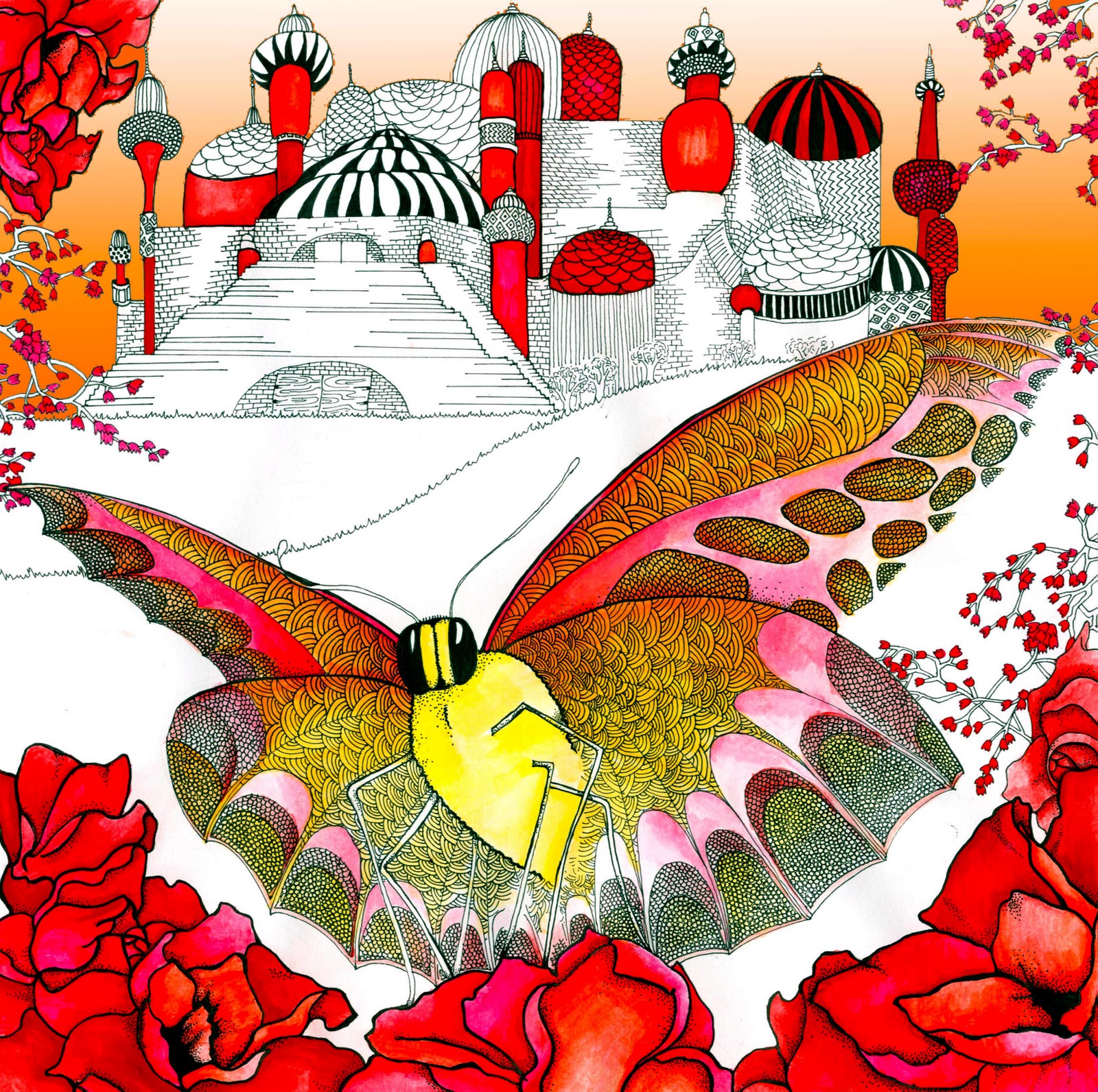

Graphic Systems
   I enjoyed this project and the challenges it brought. It was interesting researching into different book covers and graphic systems, as they are often overlooked and taken for granted. Like many other areas, it was difficult creating something original as so many book covers exist, however this made it easy to find what worked well and what did not. There are many trends associated with the book cover designs. Currently book covers tend to have very simple covers with clean designs and large typography.

   This project made me appreciate the importance of knowing the audience I am designing for and the most effective way to display different levels of information. I have found this project extremely challenging in terms of time deadlines but I feel that I kept up and produced work that I am happy with. Were I to have more time I would explore several of my other ideas in more depth.

   From this unit I have realised how difficult it is to print true to colour. I have had a lot of difficulties with colours appearing very different on screen to the actual colours that are printing. This has meant that I have had to print several documents repeatedly to find the right colours. Also text has been lost against backgrounds and gradients have become more harsh and less gradual. This has taught me the importance of leaving enough time to make sure my colours are correct before I handing files over to potential clients, and also to constantly check my work as I go along.

   I have also had difficulty with time management in this project, something I have not had trouble with before. Having several smaller projects within short spaces of time has meant that I must be constantly working to make sure my designs are on schedule for Critiques and finally the hand in. This has meant my whole design process and idea generation has had to be sped up. As I constantly try to make my work to the highest quality possible this is not something I felt very comfortable doing. This year I have also been working on other projects and live briefs which has meant juggling course work with other briefs. I am aware that I will need to learn better how to prioritise in order to get everything done. This year I have also been bearing in mind that I need to make my work of a quality which can be used in my portfolio, and that the work should represent myself and my ways of working.


Friday, November 12, 2010

Graphic Systems

      I decided to choose Ian McEwan from the list of authors as I know his books well.  Having read his books I realised that there is a strong theme of relationships running through them.  McEwan’s books are generally targetted towards a broad adult audience of both men and women.  As I have read and enjoyed several of his novels I decided to direct the cover designs at a younger audience, mid twenties to early thirties.

  I wanted to aim the book covers at a younger audience than McEwan’s current covers which are photography based designs, which I feel look tired and dull. Using brighter colours and simple uncluttered designs will make them more eye catching and appealling to a new readership.

I decided to use the important events in each story and create these as simplistically as possible in Illustrator.  Rather than using the images of people I used silhouettes as I felt the magic of a book is for the reader to make the images for themselves.

The fonts I made using circles in Illustrator  looked much more integrated with the image and more interesting than conventional typefaces.  Looking at books in bookshops I realised the book spine is particularly important as this is constantly on show.  I tried to integrate the back and spine with the front cover design to make the image flow across.  

  I have used a different colour scheme for each book relating to the storyline.  In terms of a graphic system I tried to stick as closely as I could to a frame, placing the text centrally.  However, in some cases I did need to adapt the frame to fit with the image although I do not feel that this  removes them from the Graphic System.


Wednesday, November 10, 2010

V&A Illustration

I recently saw the winning entries for the V&A Illustration Awards on display at the V&A and thought that I would enter my own this year.

I looked at several ideas for illustrations but in the end decided to illustrate two stories from the 'Just So Stories' by Rudyard Kipling.  I decided that I would illustrate 'The Butterfly that Stamped' and 'The Cat that Walked Alone'.  I wanted to use a bright colourful technique with colour washes and intricate pattern.  the books are read by both children and adults so it was important that the images would appeal to both.

The first images I produced I was not completely satisfied with, they did not hold together well and looked slightly flat.  I changed the size to make them square rather than rectangular.  This reduced any unnecessary space and made the images much more cohesive.  Once the images were finished I added a gradient pattern in Photoshop to the sky in both images, this made them much more dynamic.

I am very happy with the colours in the illustrations.  I used gouache in my final paintings, rather than watercolours, which I had previously used.  This made the colour much more intense. The shape of the canvas made a big difference in the over all composition.

Nathan Burton

Nathan Burton has done some fantastic series book cover designs.  His font choices are always very interesting and seem to fit the particular author and audience really well.  Burton's non-fiction series' by Chris Yates and Roger Deacon are particularly effective, I really like the imagery and and the way they are used to frame the book titles.  I hope to use a technique like this for my own designs.
The image I have used here is of his cover for Steve Toltz, the colours work really well on this cover and the cut out effect is different and interesting.
For more of Nathan Burton's work please visit here.

David Pearson

David Pearson is a London-based designer who has done a lot of work for covers.  Pearson's designs are a great example of Graphic systems as he uses a system for a series and changes each cover and their specified theme to fit that system.  These designs are for 'Great Loves' for Penguin, the spines look particularly good when put together, the colours all complementing each other.
For more of David Pearson's work see his website here.

Jim Tierney

While researching I came across some work by Jim Tierney. His designs are current and interesting, a great example of the direction I should head in with my book covers.  He uses break colours and clever ideas, often using textures to give his covers depth.
See more of his work here.

Monday, November 8, 2010

Pan Am Guide Covers

I absolutely love these retro Pan Am Travel Guides.  The colours are exciting and they fit together as a set really well.  The simplistic images and patterns clearly and instantly represent each country.